

Welcome to the "Building with Jacob" series, where I document my journey and experiences building Push Training. This post is written by friend and software engineer, Christine Luu, who took the initiative to build an internal tool for Push Training that enabled even better workouts using data visualization.
…
The Problem
The image below shows how workouts and workout segments have been defined to date. Creating and editing new workouts has been tedious and has needed extra attention when ensuring the workouts were correctly formatted. For example, if the user accidentally typed 5 instead of 50, the speed would only be 0.5 mph because the speed was stored in tenths. These seemingly small details can quickly create a bad user experience—causing the user to abandon the app for good.

Not only was managing the data difficult, but understanding the intensity of a workout was impossible. This was because the rows of code could not convey the flow of the workout or overall intensity. With no understanding of the intensity or flow, each workout had to be manually run to even remotely gauge how difficult the workout would be.
The Solution
After hearing how frustrating it was to update workouts in code, and how Push Training coaches would need a way to create their own workouts, it was apparent that creating an internal tool designed specifically for this use case was the solution. I offered my web development expertise and started to build a new way of managing workouts for Push Training.
The first item on the agenda was creating a way to visually look at the workouts. The product requirements stated that it had to be a line graph that supported multiple lines representing speed, incline, and intensity, and that the graph had to allow for personalization with colors, spacing, and tooltips. I researched 3rd party libraries for building line graphs that met these requirements and narrowed it down to Chart.js and D3.js because of their popularity (aka lots of documentation) and their ability to integrate into the existing tech stack. Chart.js was selected because it contains all the functionality it needed for the line graph and it was most user friendly to learn, making integration fast and easy.
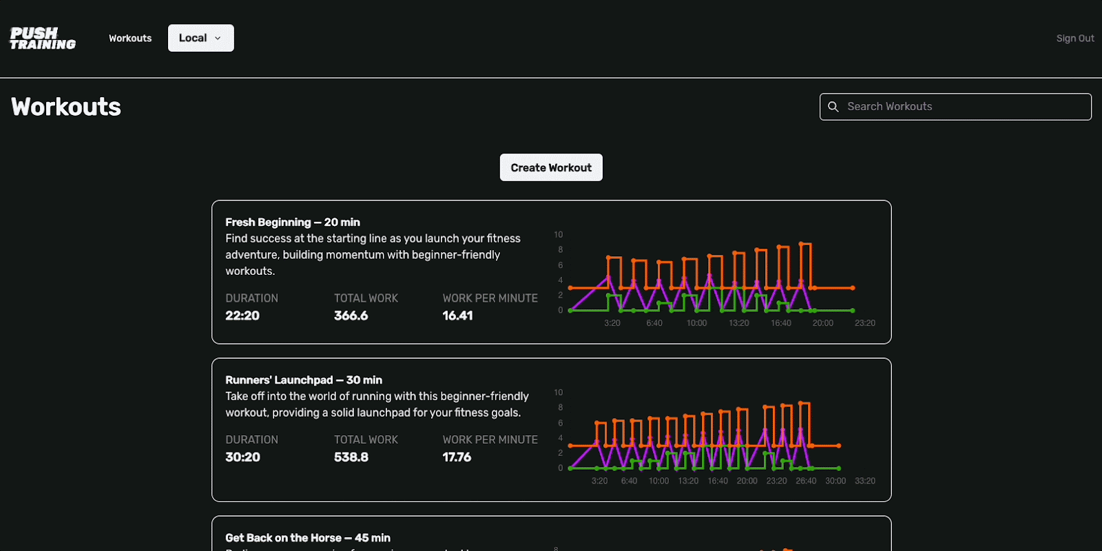
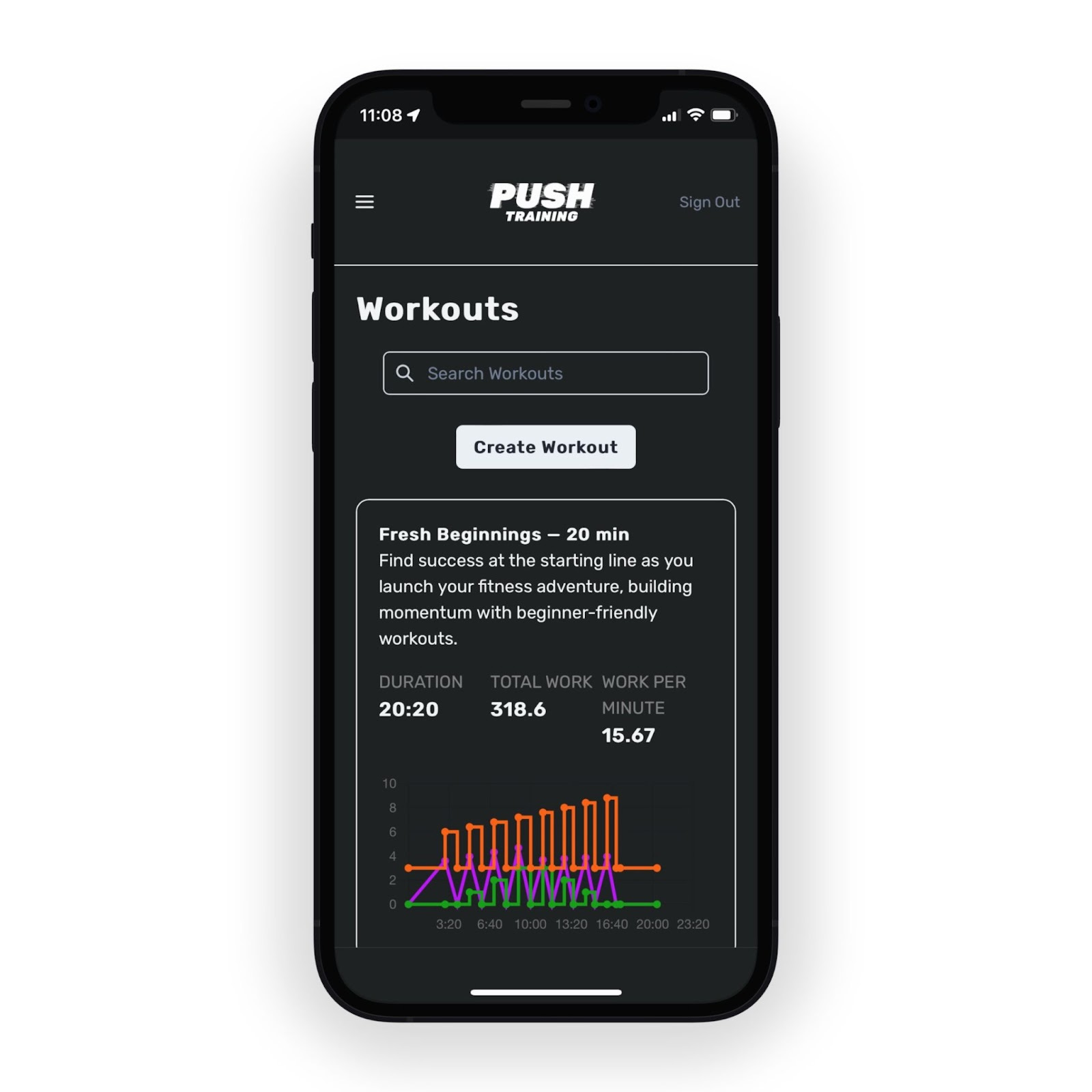
Not only does it look visually appealing on desktop, but also on mobile devices with the extra attention given to the responsive design. This empowers the team to quickly manage and update workouts on the go.
Last, we needed a way to create and update workout intervals in a very user-friendly manner. After discussing different options, the team and I decided to display the data in a table and allow for updates to be made directly on the page. Once the user hits save, the graph updates with the new interval data.

Overall, it was an insightful and exciting endeavor. The tool has already proven to be insightful and has led to meaningful changes in workouts, creating a better workout experience for the users. You can download the app here to experience the workouts, knowing they have been crafted through data visualizations.